Human People
Art Direction
Brand Design
TypographY
Human People
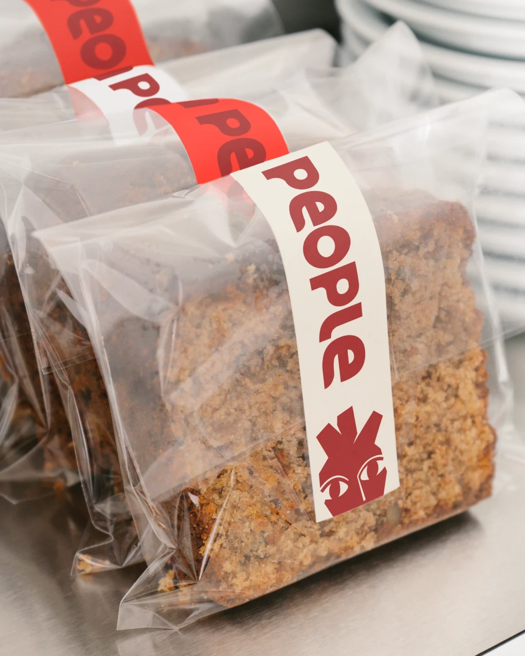
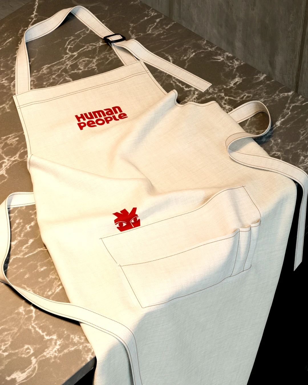
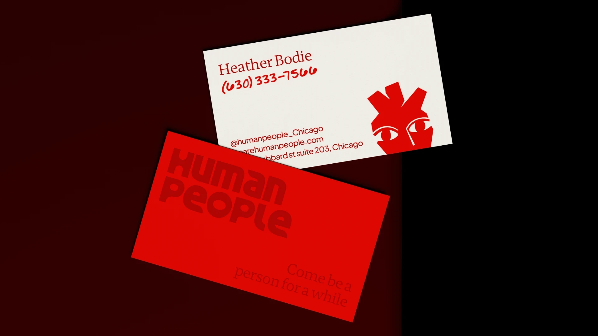
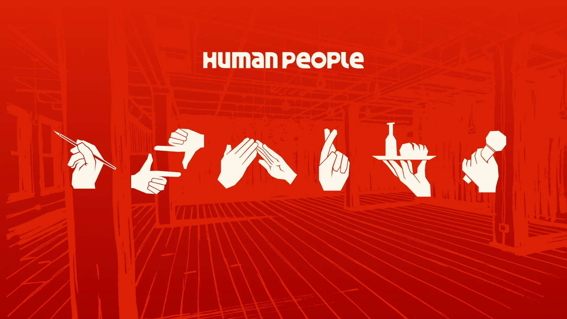
I was approached to build the brand identity for Human People from the ground up, a Chicago event and creative space designed for the kind of gathering that only really works in person. The brand needed to feel warm without being precious. Confident enough to hold its own, open enough that anyone walking through the door felt like they belonged there.
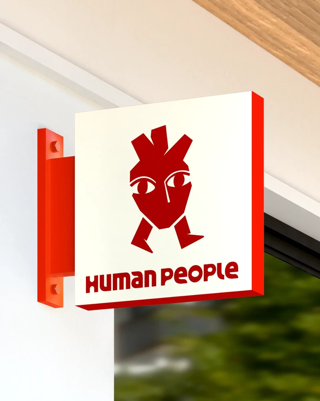
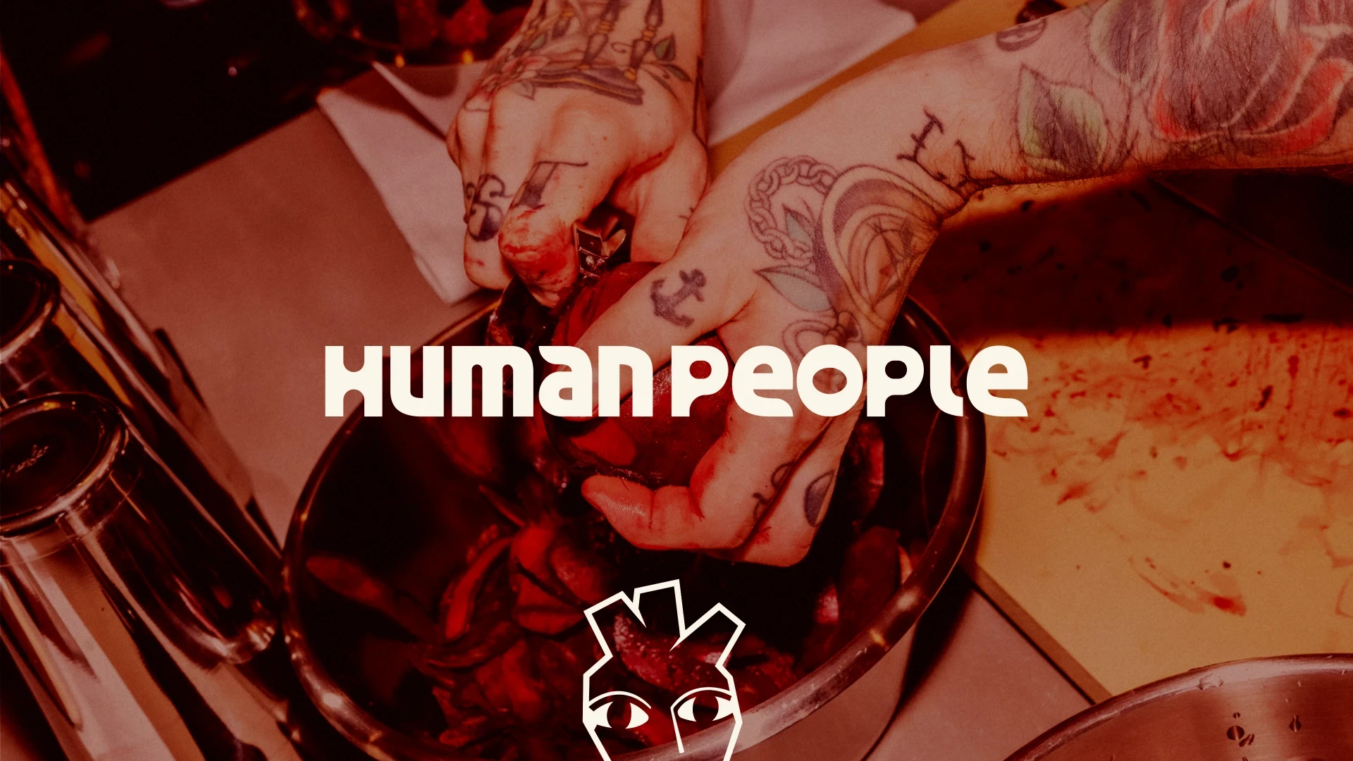
The identity started with the submark: a walking heart grounded in the idea that the best version of a space is one that lets people bring their heart to the table. From there, a full visual system took shape, a geometric wordmark, a palette inspired by the gradient made as chili oil climbs the vessel that holds it, and a type system that moves between editorial structure and handwritten honesty. The result is a brand that feels as considered as the space it represents.
Credits
Copywriter - Matt Peterson